
Hello Everyone,
On the Flexbox lessons and loving it so far. I can’t seem to figure out how to get my menu to toggle vertical and stay on screen with the same padding as the logo and sections underneath. In addition, white space appears from the right.
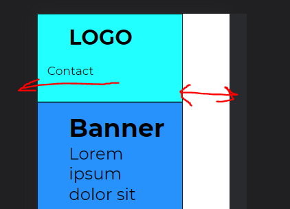
Below you’ll find the full HTML and CSS. Anyone able to give me a few pointers??
HTML
<!DOCTYPE html>
<html lang="en">
<head>
<meta charset="UTF-8">
<meta http-equiv="X-UA-Compatible" content="IE=edge">
<meta name="viewport" content="width=device-width, initial-scale=1.0">
<link rel="stylesheet" href="css/styles.css">
<title>Page Layout</title>
</head>
<body>
<!-- NAVIGATION BAR IN HEADER -->
<header class="container">
<!-- LOGO -->
<h1 class="logo">LOGO</h1>
<nav class="navbar">
<!-- NAVIGATION MENU -->
<ul class="nav-links">
<!-- NAVIGATION MENUS -->
<div class="menu">
<li><a href="/">Home</a></li>
<li><a href="/">About</a></li>
<li><a href="/">Pricing</a></li>
<li><a href="/">Contact</a></li>
</div>
</ul>
</nav>
</header>
<!-- MAIN SECTIONS -->
<main class="main-container">
<article>
<section class="container section-banner">
<h2>Banner</h2>
<p>Lorem ipsum dolor sit amet, consectetur adipisicing elit. Hic deleniti ipsum cum corrupti voluptas sed?</p>
</section>
<section class="container section-features">
<h2>Features</h2>
<p>Lorem ipsum dolor sit amet, consectetur adipisicing elit. Hic deleniti ipsum cum corrupti voluptas sed?</p>
</section>
<section class="container section-testimonials">
<h2>Testimonials</h2>
<p>Lorem ipsum dolor sit amet, consectetur adipisicing elit. Hic deleniti ipsum cum corrupti voluptas sed?</p>
</section>
<section class="container section-contact">
<h2>Contact</h2>
<p>Lorem ipsum dolor sit amet, consectetur adipisicing elit. Hic deleniti ipsum cum corrupti voluptas sed?</p>
</section>
</article>
</main>
<aside>
<section class="container section-aside">
<h2>Aside</h2>
Banners & adds
</section>
</aside>
<footer class="container">
<h2>Footer</h2>
<p>Copyright © Cryptocommunity 2022</p>
<nav>
<ul>
<li><a href="#">Home</a></li>
<li><a href="#">About</a></li>
<li><a href="#">Contact</a></li>
<li><a href="#">Webinars</a></li>
</ul>
</nav>
</footer>
</body>
</html>
CSS
    /* UTILITIES */
    * {
    margin: 0;
    padding: 0;
    box-sizing: border-box;
    }

    body {
    font-family: montserrat;
    }

    a {
    text-decoration: none;
    }

    li {
    list-style: none;
    }

    html {
    font-size: 16px;
    }


    /* LOGO */
    .logo {
        display: flex;
        justify-content: flex-start;
        align-items: center;
        width: 30%;
        font-size: 32px;
        }

    /* NAVIGATION BAR */
    .navbar {
        display: flex;
        justify-content: flex-end;
        align-items: center;
        width: 70%;
        padding: 20px;
        background-color: aqua;
        color: #fff;
        }

    /* NAVBAR MENU */
    .menu {
        display: flex;
        gap: 1em;
        font-size: 18px;
        padding-right: 30px;
        }


    /* NAVIGATION LINKS */
    .nav-links a {
        color: rgb(0, 0, 0);
        }

    /* CONTAINERS */


    .container {
        background-color: aqua;
        font-size: 1.6rem;
        padding: 1rem 3rem;
        margin: 0 auto;
        border: 1px solid black;
        }

     .section-banner {
        background-color: dodgerblue;
        }

    .section-features {
        background-color: rgb(235, 34, 135);
        }

    .section-testimonials {
        background-color: rgb(255, 255, 0);
        }

    .section-contact {
        background-color: rgb(217, 217, 186);
        }

    .section-aside {
        background-color: rgb(50, 190, 22);
        }


@media screen and (min-width: 576px) {
  header.container {
    display: flex;
  }
}
Thanks in advance!