no idea. sorry 
The Stock and Commodities Ratio chart usually shows the S&P 500 Index as well as Stock/Commodities Ratio for greater bench marking. I think the chart the tweeter posted is the is trying to convey that since this “Ratio” is even further outside of historical trends. Stocks in the S&P 500 are over priced an ideally an investor should take whatever profits and hold it in cash. However, historically when these investors were holding cash and decided to be less risk averse. Those who invested some of that cash into the gold market. As a result saw gold prices soar. Those who are less risk averse investors now have another avenue of holding their cash and that is $BTC.
In other words, we could expect the Stocks to go down and Gold to go up (following historical trends). But now we have BTC to break these trends and change the game 
I agree with both euthyphro and trauzki as to what the tweeter is trying to say.
However after you play around with charts you can either find one that can back-up an idea or you can easily get confused.
The tweet is both i. nonsensical but also ii. powerful.
i.The chart and statement refer to different things. Commodities? (What is the weight of gold, if any?). Stocks? (S&P, Dow or could be EUR/GBP based etc?).
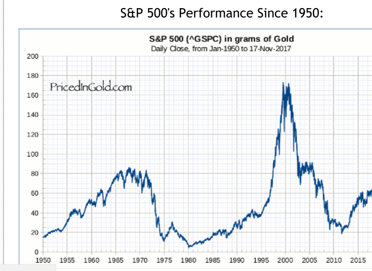
A more direct comparison could be to look at the S&P 500 valued in Gold. As in this chart taken of a website on the internet.
“BTC could get fun” - It has been for quite a while - in terms of price appreciation neither the global stocks nor gold can compare to BTC, even in the last few months.
ii. Powerful - the tweet is catchy and delivered in a way that appeals to many investors and the public at large, such messages can actually influence (rightly or wrongly) and move markets.
What I agree with is that when the next major stock crash takes place, there will be a movement of $$$s to other assets and BTC to an extent will be one of the recipients.