Building Web Layouts with Flexbox and Grid question

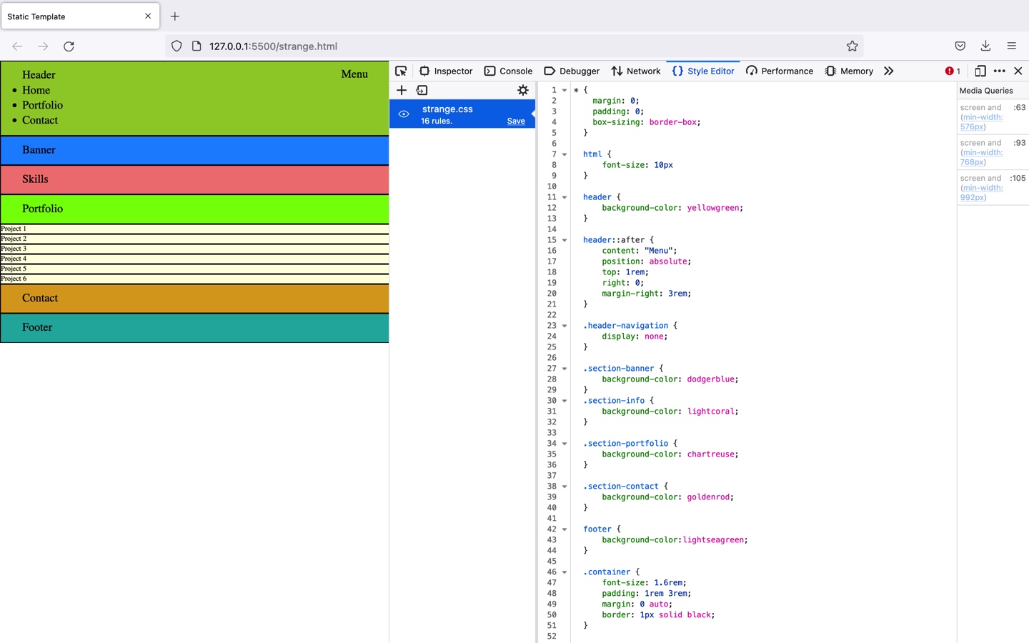
I have reviewed my code with the professor and cannot figure out why I am getting 3 columns that don’t span the entire screen. I even copied the professor code and go the same thing. Can you please explain this to me?

* {
padding: 0;
margin: 0;
box-sizing: border-box;
}

html {
font-size: 10px;
}
header {
background-color: yellowgreen;
}
header::after{
content: "Menu";
position: absolute;
top: 1rem;  
right: 0;
margin-right: 3rem;
}
.header-navigation{
    display: none;
}

.section-banner {
background-color: blue;
}
.section-info {
    background-color: red;
}
.section-portfolio{
background-color: green;
}
.section-contact{
    background-color: yellow;
}
.section-footer{ 
    background-color: lightseagreen;
}
.container{
font-size: 1.6rem;
padding: 1rem 3rem;
margin: 0 auto;
border: 1px solid black;
}
.portfolio-list {
    list-style: none;
}
.portfolio-item {
    background-color: lightyellow;
    border: 1px solid black;
}

@media screen and (min-width: 576px) {
    header{ 
        display: flex;
    }
    header::after{
        content: none;
    }
    .header-logo{
        flex-grow: 2;
    }
    .header-navigation {
        display: inline-block;
        flex-grow: 3;
    }
.menu-list{ 
    list-style: none;
    display: flex;
justify-content: flex-end;
}
.menu-item{ 
border: 1px solid black;
background-color: deepskyblue;
margin: 0 1rem;
    }
}
@media screen and (min-width: 768px){
  .portfolio-list{
    /*display: grid;
    grid-template-columns: auto auto;*/
display: flex;
flex-wrap: wrap;
}
.portfolio-item{ 
    width: 50%;
    }
}
@media screen and (min-width: 992px){
    .container {
        width: 100%;
    }
    .portfolio-item {
        width: calc(100% / 3);
    }
    main {
    display: flex;
    flex-wrap: wrap;
    }   
    .section-banner,
    .section-info {
    width: 50%;
    }
    .section-portfolio,
    .section-contact {
    width: 100%;
    }

}

Thank you!

1 Like

Hi S_dot24,

I have the same thing. I also cannot figure this out. I will ask my counseler Mauro and keep you posted.

greetings,

Hi,

If i screensize reduces the menu items are lined up under “Header”:

What I am doing wrong?

Greetings,

1 Like

Hey @Stinkiz, could you please share your code in the following way?

Carlos Z

* {
    margin: 0;
    padding: 0;
    box-sizing: border-box;
  }
  
  html {
      font-size: 10px
  }
  
  header {
      background-color: yellowgreen;
  }

  header::after {
      content: "Menu";
      position: absolute;
      top: 1rem;
      right: 0;
      margin-right: 3rem;
  }

  .header-navigation {
      display: none;
  }

  .section-banner {
      background-color: dodgerblue;
  }
  .section-info {
      background-color: lightcoral;
  }

  .section-portfolio {
      background-color: chartreuse;
  }

  .section-contact {
      background-color: goldenrod;
  }

  footer {
      background-color:lightseagreen;
  }

  .container {
      font-size: 1.6rem;
      padding: 1rem 3rem;
      margin: 0 auto;
      border: 1px solid black;
  }

.portfolio-list {
    list-style: none;
}


.portfolio-item {
      background-color: lightyellow;
      border: 1px solid black;
  }

  @media screen and (min-width: 576px) {
      header {
          display: flex;
      }

      header::after {
          content: none;
      }

      .header-logo {
          flex-grow: 2;
      }

      .header-navigation {
          display: inline-block;
          flex-grow: 3;
      }
.menu-list {
    list-style: none;
    display: flex;
    justify-content: flex-end;
}

      .menu-item {
          border: 1px solid black;
          background-color: deepskyblue;
          margin: 0 1rem;
      }
  }

@media screen and (min-width: 768px)
{
    .portfolio-list {
        display: flex;
        flex-wrap: wrap;
    
}
.portfolio-item {
    width: 50%;
    }
}

@media screen and (min-width: 992px) {
    .container {
     width: 100%;

    }

    .portfolio-item {
        width: calc(100% / 3);
    }
    
    main {
        display: flex;
        flex-wrap: wrap;
    }

    .section-banner,
    .section-info {
        width: 50%;
    }

    .section-portfolio,
    .section-contact {
        width: 100%;
    }
}
<!DOCTYPE html>
<html lang="en">
    <head>
        <meta charset="UTF-8"/>
        <meta name="viewport" content="width=device-width, initial-scale= 1.0"/>
        <meta http-equiv="X-UA-Compatible" content= "ie=edge"/>
        <title>Static Template </title>
        <link rel="stylesheet" href="strange.css"/>
    </head>
<body>
 <header class="container">
  <div class="header-logo">Header</div>
  <nav class="header-navigation"></nav>
    <ul class="menu-list">
     <li class="menu-item">
        Home
     </li>
     <li class="menu-item">
         Portfolio
     </li>
     <li class="menu-item">
        Contact
     </li>
    </ul>
   </nav> 
 </header>
<main>
    <section class="container section-banner">
        Banner
    </section>
    <section class="container section-info">
        Skills
    </section>
    <section class="container section-portfolio">
        Portfolio
    </section>
     <ul class="portfolio-list">
        <li class="portfolio-item">Project 1</li>
        <li class="portfolio-item">Project 2</li>
        <li class="portfolio-item">Project 3</li>
        <li class="portfolio-item">Project 4</li>
        <li class="portfolio-item">Project 5</li>
        <li class="portfolio-item">Project 6</li>
     </ul>
    </section>
    <section class="container section-contact">
        Contact
    </section>
</main> 
<footer class="container">Footer</footer>

</body>
</html>
1 Like

can you add display: flex to your header-navigation clsss

Hi Thecil,

Do you have an answer on my question?

Thank you.

1 Like

have u tried adding display flex as i mentioned above. if its still not working can u share your github repo and i will clone it and make the fix