Hello I know this is probably the stupid question but I cant figure it out how to put the inline blocks next to each other… second block always collapse under.
its probably because I need to comment out the whitespace but I just don’t get it where to put it !
I tried it many ways but it didn’t work .I can send my line code if necessary.
Hey @noro377, hope you are well.
You might wanna take a look again to this lesson, which explain all the block inline.
https://academy.moralis.io/lessons/block-inline-inline-block-2
Also you can share your code in the following way so we can review it and help you properly:
Carlos Z
<!DOCTYPE html>

<html lang="en">

<head>

    <meta charset="UTF-8">

    <meta http-equiv="X-UA-Compatible" content="IE=edge">

    <meta name="viewport" content="width=device-width, initial-scale=1.0">

    <title>Document</title>

    <link rel="stylesheet" href="./css/styles.css">

</head>

<body>

<h1>Hello, Moralis!</h1>

<p class="dashed-border d-inline-block">

        Lorem ipsum dolor sit

        amet consectetur adipisicing

        elit. Similique consequatur laboriosam

        alias blanditiis eveniet dolorum.</p>

        <p class="dashed-border d-inline-block">

        Lorem ipsum dolor sit

        amet consectetur adipisicing

        elit. Similique consequatur laboriosam

        alias blanditiis eveniet dolorum.</p>

    <p id="moralis-reference"> Visit <a href="https://moralis.io/" target="_blank">Moralis.io</a>

    and start <strong>Build</strong>ing </p>

    <h2>Part 1: Example </h2>

    <p>Lorem ipsum dolor sit amet.</p>

    <p>Perspiciatis neque ab perferendis dolor?</p>

    <h3>Chapter 1: Metamask login </h3>

    <img src="./images/loginregistration.png" alt="login-reg." width=320vw>

    <h3>Chapter 2: Loading NFTs </h3>

    <h4>Section 2.1:BigBoy Pants </h4>

    <h4>Section 2.2:Pumpkins </h4>

    <h2>Part 2: Building a DEX </h2>

    <ol>

        <li>Bitcoin</li>

        <li>Ethereum</li>

        <li>Tether</li>

     </ol>

     <ul>

        <li>Bitcoin</li>

        <li>Ethereum</li>

        <li>Tether</li>

    </ul>

    <form action="#" method="POST">

    <label for="coin"> Coin: </label>

    <input type="text" placeholder="coin" >

    <label for="amount"> Amount: </label>

    <input type="number" placeholder="amount" >

    <button type="submit"> Buy  </button>

    </form>

    <p> This is an update </p>

</body>

</html>
Here is my Styles.css
*{

    margin:0;

    padding:0;

    box-sizing: border-box;

}

#moralis-reference{

    text-shadow: 1px 2px 6px red;

}

.dashed-border{

    border:2px dashed darkblue

}

.d-block{

display:block;

}

.d-inline{

display:inline;

}

.d-inline-block{

  display:inline-block;

}

body{

background-color: #C4C93B;

}

button {

    border:none;

    box-shadow: 3px 5px 9px rgb(160, 26, 26);

    cursor:pointer;

}

form{

    margin:30px;

    border:2px solid black;

    padding:15px;

}

[type=text], [type=number], [type=submit] {

    padding: 8px;
}
It probably doesn’t work because I need to comment out the wtitespace in index.html file I tried many ways but it didn’t work thanks in advance.
You will most likely appreciate the Flexbox section. Inline-block is tough to deal with for multi-column layout. Regarding inline-block, find an example that works (e.g. https://www.w3schools.com/css/tryit.asp?filename=trycss_inline-block_nav, https://www.w3docs.com/snippets/css/how-to-create-two-inline-block-columns-with-50-width.html), and proceed from there. In your CSS, I am missing a set width to the inline-block rectangles you wanted to place next to each other.
Ok thank you for your help!! I appreciate that. I will check it out and fix it. And I already started with Flexbox but I just wanted to make sure I can fully master inline-blocks first.
I am having the exact same problem. So far the the only way I could sort it out was to set the width to the inline-block to 49%. At 50% the blocks stack on top of each other. I will dig through the web3schools links to see if i can figure it out.
i tried to set width 50% and the margin -2px and it worked for me!
Be careful with negative margins! It’s a hack basically.
Options
- calc(50% - 4px) will set the width respecting the extra margin space
- adding a proper reset to remove browser default styles * { margin: 0; padding: 0; }
- using box-sizing: border-box; to eliminate unwanted padding and border size calculations, see https://www.paulirish.com/2012/box-sizing-border-box-ftw/
- more importantly, if you want multi-column layout, simply use Flexbox and you don’t have to worry about any of these
ok thanks for pointing out . 
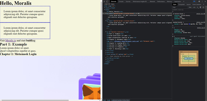
Hi, beginner question:
im doing the “block, inline, inline block” lesson. I am at the end but i don’t get the same result as the example.
i suppose i missed something but i cant seem to find what. Probably somwhere at:
--><p id="moralis-reference"> Visit <a href="https://moralis.io/" target="_blank">Moralis.io</a> and start <strong>buidl</strong>ing</p>
my colums stay underneath each other.
any help appreciated!
body>

   <h1>Hello, Moralis</h1>

   <p class="dashed-border d-inline-block">

    Lorem ipsum dolor, sit amet consectetur adipisicing elit.

    Pariatur cumque quasi eligendi sunt delectus quisquam.

</p>

    <p class="dashed-border d-inline-block">

    Lorem ipsum dolor, sit amet consectetur adipisicing elit.

    Pariatur cumque quasi eligendi sunt delectus quisquam.

</p><!--

    --><p id="moralis-reference"> Visit <a href="https://moralis.io/" target="_blank">Moralis.io</a> and start <strong>buidl</strong>ing</p>

<h2>Part 1: Example</h2>

<p>Lorem ipsum dolor sit amet.</p>

<p>Quod voluptatibus repellat at quos.</p>

<h3>Chapter 1: Metamask Login</h3>

<img src="./Metamask image/Metamask_Login.png"

    alt="Metamask Login"/>

<h3>Chapter 2: Loading NFTs</h3>

<h4>Section 2.1 BigBoy Pants</h4>

<H4>Section 2.2 Pumpkins</H4>

<h2>Part 2: Building a DEX</h2>

<ol>

    <li>Bitcoin</li>

    <li>Ethereum</li>

    <li>Tether</li>

</ol>

<ul>

    <li>Bitcoin</li>

    <li>Ethereum</li>

    <li>Tether</li>

</ul>

<Form action="#" method="get">

    <label>

        Coin:

        <input type="text" name="coinName" placeholder="Coin" required>

    </label>

    <label>

        Amount:

        <input type="number" min="0" name="CoinQuantity" placeholder="amount" required>

        </label>

        <input type="password" name="password" placeholder="password">

        <button type="submit">Buy</button>

</Form>

</body>

</html>

<ul><li>Lorem ipsum dolor sit amet</li></ul>`Preformatted text`
update:
I just found the mistake… 

